Skills
UX Research · Interaction Design · Design Systems · Self-Serve
20%
Ticket reduction
6 weeks
Concept to shipped
10k+
Monthly requests affected
Zapier already had a structured support flow. When users ran into trouble, a guided form helped them describe their issue before reaching the support team. It worked — specialists received well-organized requests and could resolve them efficiently.
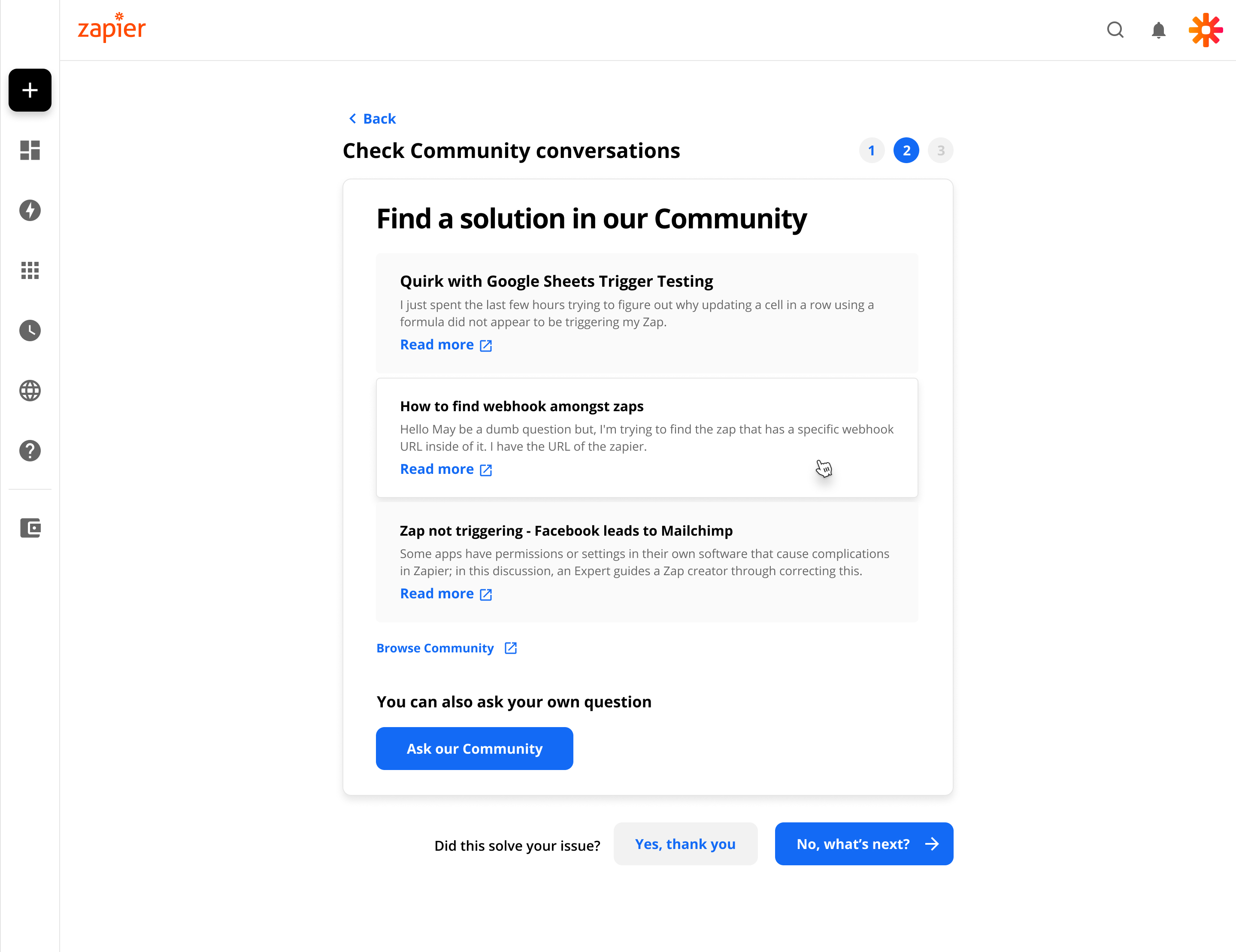
The problem was volume. As Zapier grew, more users meant more tickets, and the support team couldn’t scale indefinitely. At the same time, Zapier had invested heavily in help documentation and a community forum — resources that were genuinely useful but weren’t connected to the moment when users were actually asking for help.
The flow was doing one job well. It needed to do two.
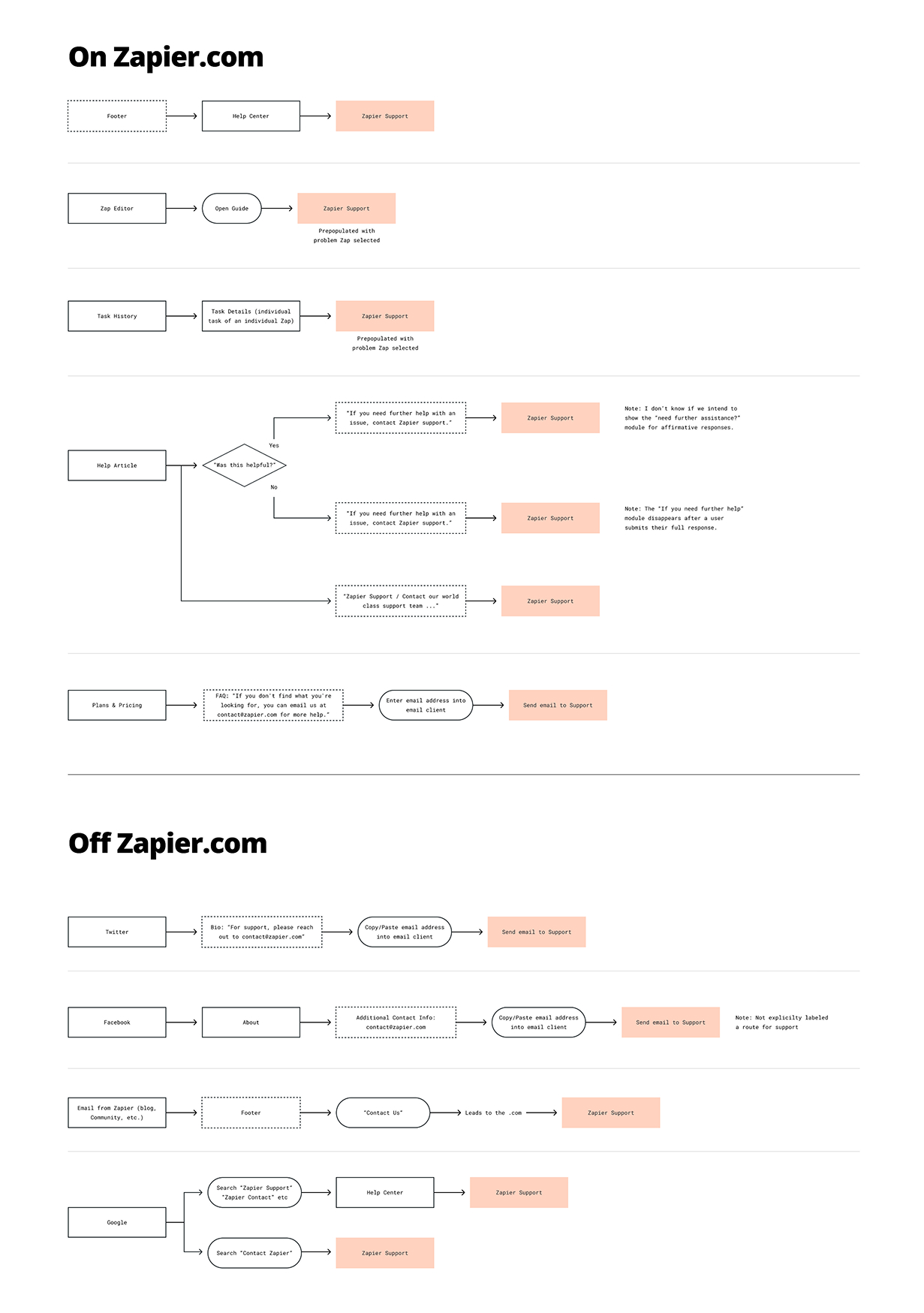
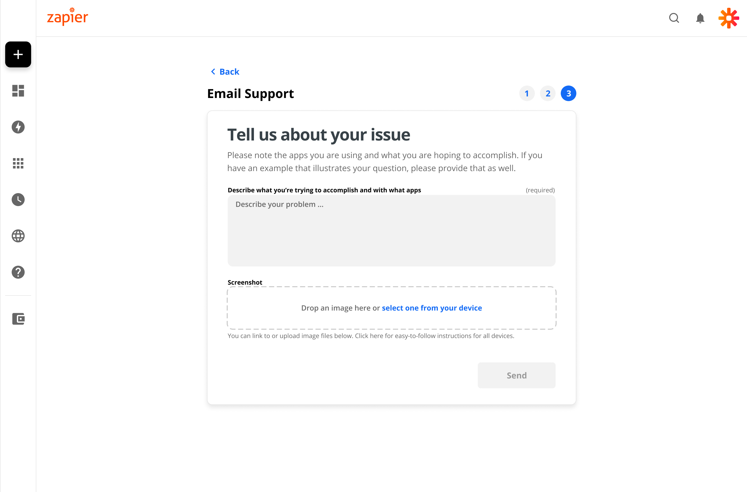
The form structure was already solid. Users moved through a series of steps that captured meaningful context about their issue. Rather than redesigning from scratch, I focused on what happened after that context was gathered — using it to surface relevant resources before routing users to the queue. A new system would have meant retraining users and rebuilding trust. Building on what existed meant the improvement could ship faster and feel familiar.
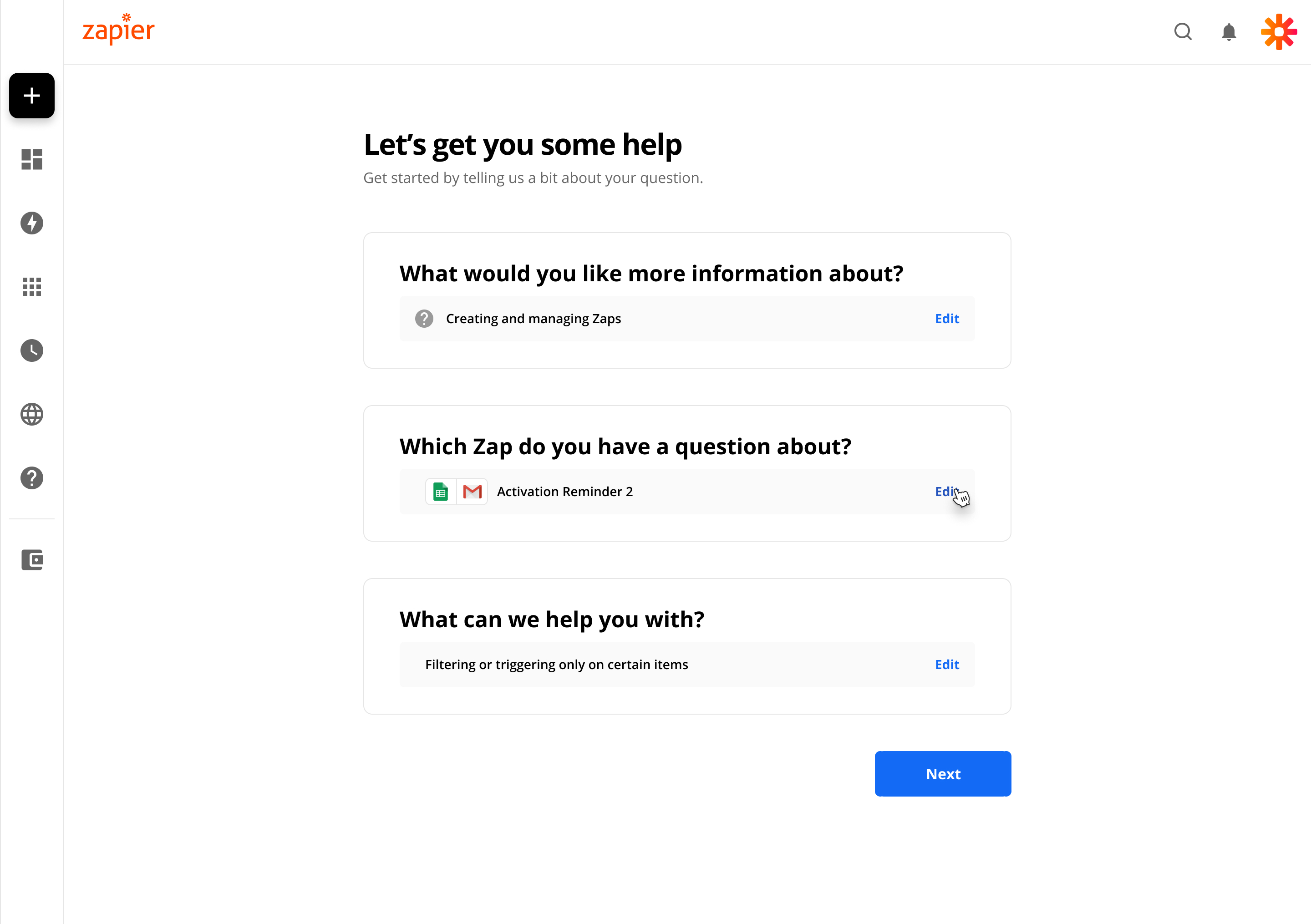
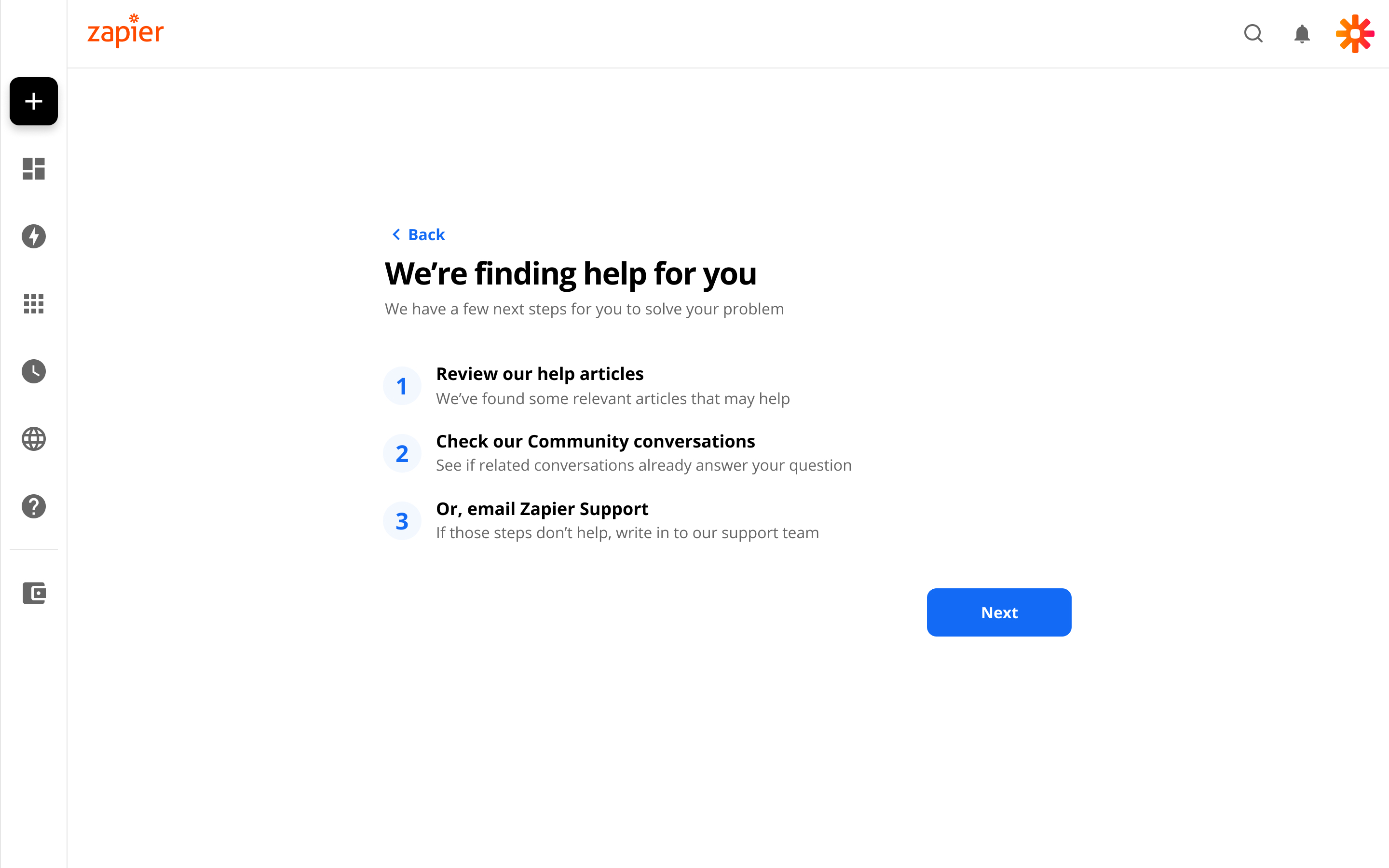
Once the flow had enough context to understand the issue, it shifted from intake to assistance. Instead of proceeding directly to ticket submission, users encountered structured checkpoints — relevant help articles, community discussions, and troubleshooting steps tailored to their situation. Escalation to a human remained available throughout. But it became a deliberate step, taken after exploring self-serve options — not the automatic outcome of entering the flow.
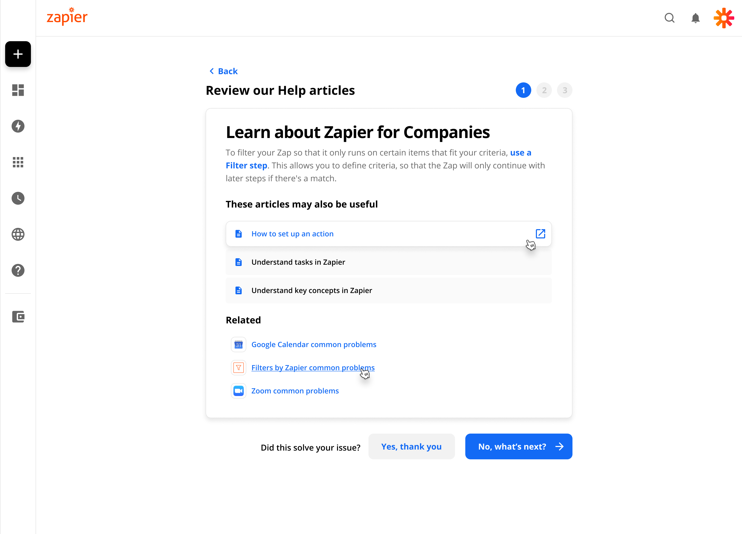
In parallel, I refactored the interface to align with Zinnia, Zapier’s design system. This meant standardizing components, improving visual hierarchy, and ensuring accessibility across steps. The work made the experience feel more cohesive — and made it easier to maintain as the product evolved.
This project happened during Zapier’s transition toward paywalled support — where human assistance became a paid feature for higher-tier plans. That context shaped the design. The self-serve pathways weren’t just about reducing tickets — they needed to serve users well regardless of what plan they were on. Free users deserved a real path to resolution, not just a dead end.
That tension made the community integration especially important. It gave every user access to real answers, without requiring a ticket or an upgrade.
Support tickets decreased by 20%. More users resolved issues through self-serve pathways, and the experience shifted from a purely reactive intake model to one that could resolve a meaningful share of issues before they reached the queue.
The updated interface also supported Zapier’s broader design system adoption — bringing a frequently-used flow in line with Zinnia ahead of the paywalled support transition.
© 2026 Adam Baumgartner
